Unified Platform Navigation - Sonatype
Sonatype's products are stronger together, but they didn't feel that way. Each application had its own siloed experience, with no coherent way for users to move between them or grasp the larger platform they were paying for. I was selected to lead a year-long, company-wide initiative to close that gap: a shared navigation system across every product, and a centralized "atrium" where users could reach their applications, their education, and everything Sonatype offers.

Company
Sonatype
Date
H1 2024
Role
Senior Product Designer, Project Lead

The Problem
Sonatype's applications are built to work best interconnected, but each had been shipped as its own island. A user inside one product had no path to another, no shared frame, no sense of the suite as a whole. For a company selling an integrated platform, that fragmentation quietly worked against the core value proposition, so senior leadership made platform-level UX a priority.
The Objectives & Key Results
The initiative had two goals:
A centralized "atrium" space where users could reach information about their applications, their licenses, and Sonatype's other free and paid products.
A shared navigation component that let users move between their applications and instances from inside the products themselves.

The Process
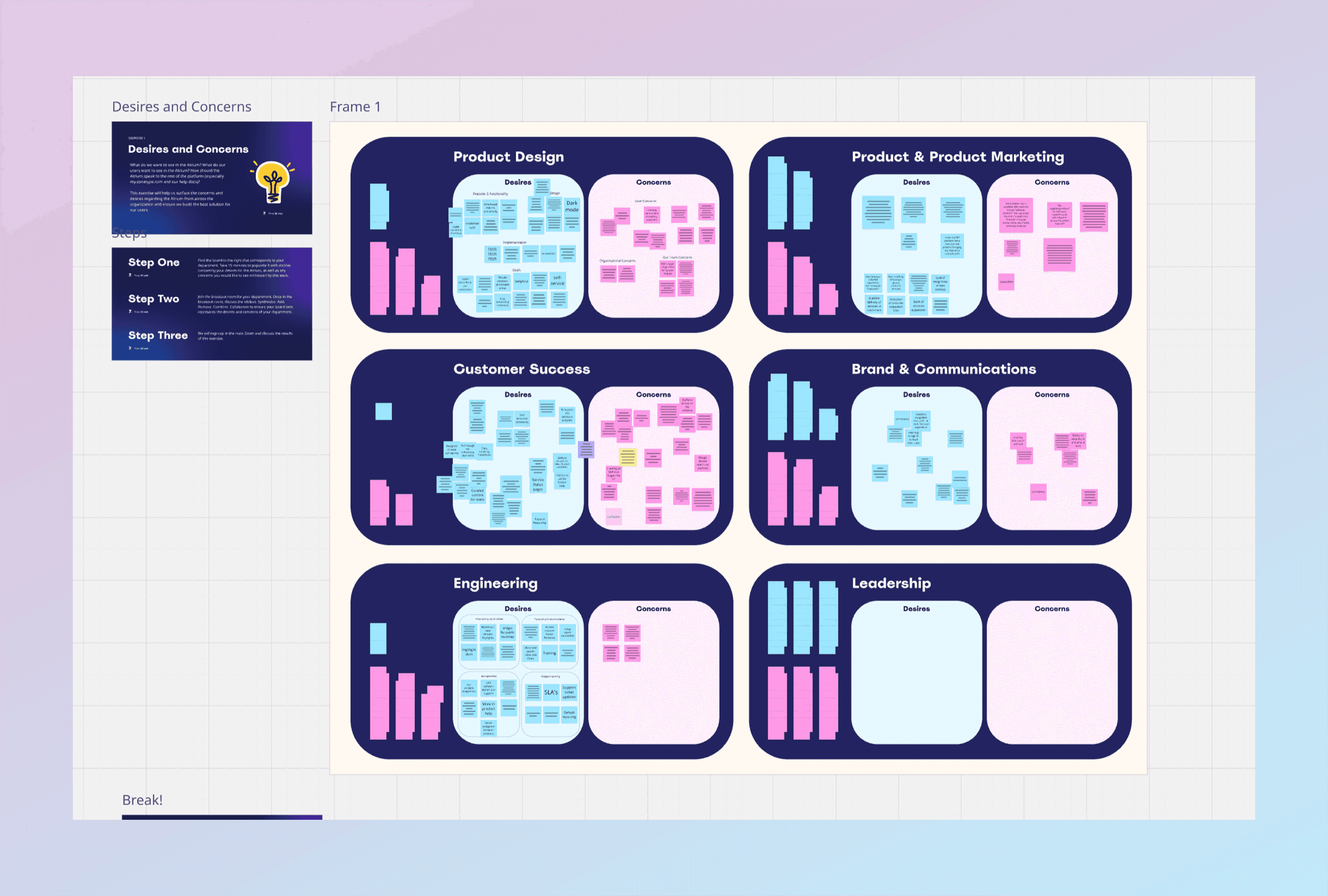
Because the impact reached across the whole platform, I opened with a month-long series of brainstorming workshops, pulling in stakeholders from every segment of the organization, from product design through senior leadership. We pressure-tested the output through surveys, stakeholder interviews, and usability testing, including Maze surveys on specific UX choices.
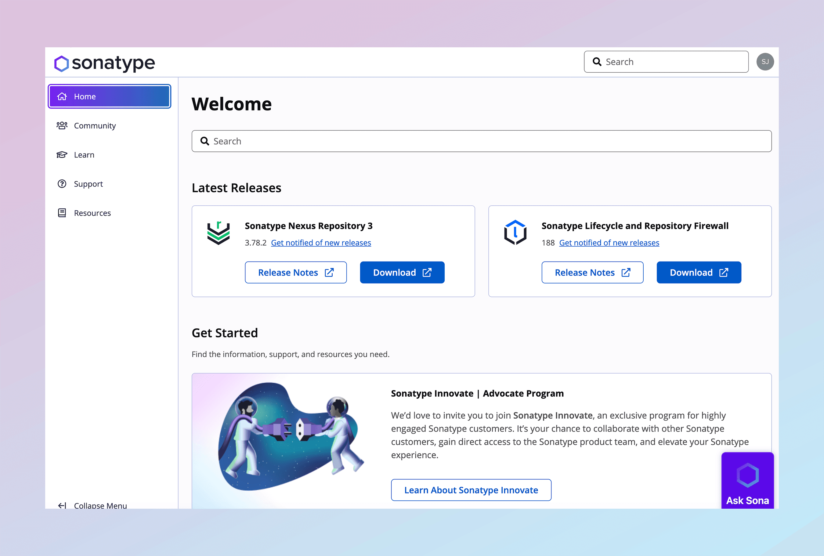
Discovery surfaced something useful. Customer Success had already built a site at my.sonatype.com with much of what Product now wanted: community forum links, training and documentation, software downloads, and product information. That team moved into Product, and their site became the foundation for the atrium, extended with links to users' applications, license management, and the shared navigation component, now called the Solution Switcher.
The build started by lifting and shifting My Sonatype from its existing codebase into React, so it could run on the Kaleido and Tartan design system. From there, I reworked the side and top navigation into one unified interface across the platform, which set up the Solution Switcher as the capstone.

The Solution
The top and side navigation came together over many iterations, stakeholder interviews, and user research. It was fully WCAG compliant, built on a clean white background with active states color-coded to each product's logo. The shared versions went into the design system library for adoption across the product suite.
The Solution Switcher was the centerpiece: a dropdown panel linking to each product, split into what a user has purchased and what they haven't, with a path back to My Sonatype from any application. Because some applications run multiple instances tied to instances in other products, I added a secondary panel for selecting an instance.
My Sonatype itself moved onto the design system components, and I used the migration to modernize a few of them, lightening the page background and restyling the cards and tiles.

The Results
The initiative shipped on time and landed well across the organization. The Product teams took up the new navigation in earnest, even against competing priorities and the real work of rearchitecting site maps for products that had never shared an interface, despite their different SKUs, names, and context. Formal end-to-end validation testing was cut short by a company reorganization, so I won't overstate the outcome. But the feedback reaching sales, customer success, and leadership from customers was positive.