Design System Dark Mode - Sonatype
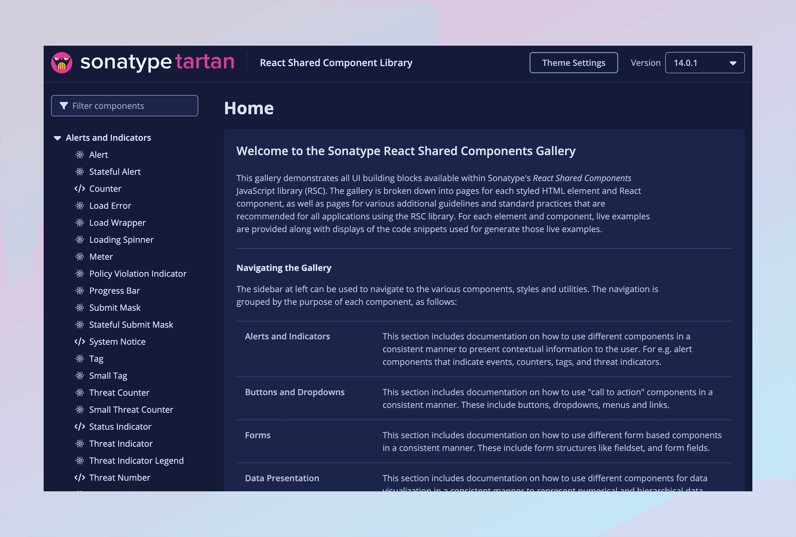
Over 70% of the typical Sonatype user (the developer, engineer, and security personas who live in the product all day) prefer to work in dark mode. The design system only existed in light. I was chosen to lead the initiative to close that gap: dark mode variants for every component and design token in the system. Sonatype's design system has two halves, Kaleido, the component library and guide designers work in, and Tartan, the developer's shared component library. As a senior product designer on the team, I owned the work end to end.
Company
Sonatype
Date
H1 2023
Role
Senior Product Designer, Initiative Lead

The Problem
Dark mode is not a simple color inversion. Most dark modes fail to meet WCAG accessibility requirements, slipping below the contrast ratios that keep an interface legible. For an enterprise product that was also a legal exposure: the components had to be ADA compliant. There was an additional constraint underneath the first: light Mode was built on a carefully tuned set of semantic color tokens, and any new mode had to preserve those exact relationships, so nothing broke across the product suite that depends on the library.

The Objectives & Key Results
Build a dark mode for Sonatype's design system that would:
Meet at least Level A WCAG compliance.
Work across every existing use of the library in product, validated with internal stakeholders.
Prove its usability and delight through testing with at least 20 participants drawn from the product's core user personas.

The Process
Light Mode was built on design tokens mapped to a set of HSL color variables, with Indigo as the base. I kept Indigo as the foundation of Dark Mode too. Most dark modes lean on blacks and greys, so this made the mode distinctly Sonatype's while preserving users' familiarity with the existing components.
Working from mockups of real product pages, I built the Dark Mode tokens to mirror the semantic relationships of the Light Mode set, inverting the colors while holding the same proportional contrast. That kept the new mode aligned with both the brand and the accessibility guidelines from the first draft.
I then validated the tokens internally, through iterative critiques with the Design Studio and interviews with stakeholders, before handing the finished designs to development.

The Solution
The finished dark mode shipped two months ahead of schedule and exceeded the target, landing at WCAG Level AA, one level above what was required. Because Sonatype's component library is open source, you can see it live by adjusting the Theme Settings in the top navigation of the component gallery at gallery.sonatype.dev/ .

The Results
The final dark mode was tested with 47 users from the core Developer, DevOps, and Security personas through a Maze survey, and the findings were shared with executive stakeholders in a dedicated deck.
Asked to describe the new mode from a list of 20 words, users overwhelmingly reached for one: "calming," chosen by 50% of Developers, 35% of DevOps specialists, and 50% of Security professionals. One put it plainly: "Somehow dark mode makes me feel less anxious with all of the overwhelming information from the policy violations." Another called it "a visually stunning and immersive experience."
That "calming" response is the result I'm proudest of. For an enterprise security tool full of policy-violation alerts, lowering the felt anxiety of the interface isn't cosmetic. It is what keeps people in the product. Delight, here, was a retention lever.
