ParkChicago Mobile App Redesign
ParkChicago is the app more than a million drivers reach for at the curb to manage and track payment for parking. I rebuilt it end to end, then shipped it as a working, interactive app rather than a set of static screens. The redesign strips away the tips, warnings, and legalese the original buries its core task beneath, and rebuilds the pay-for-parking flow to be clear enough that none of that scaffolding is needed. It is also a design system, designed and built in code, using an AI-assisted workflow where the judgment stayed mine. A real, running product, not a mockup.
If you'd like to explore the live app, it lives here: https://parkchicago-janedouglass.netlify.app/

Company
ParkChicago (Personal Portfolio Project)
Date
Q2 2026
Role
Senior Product Designer
The Problem
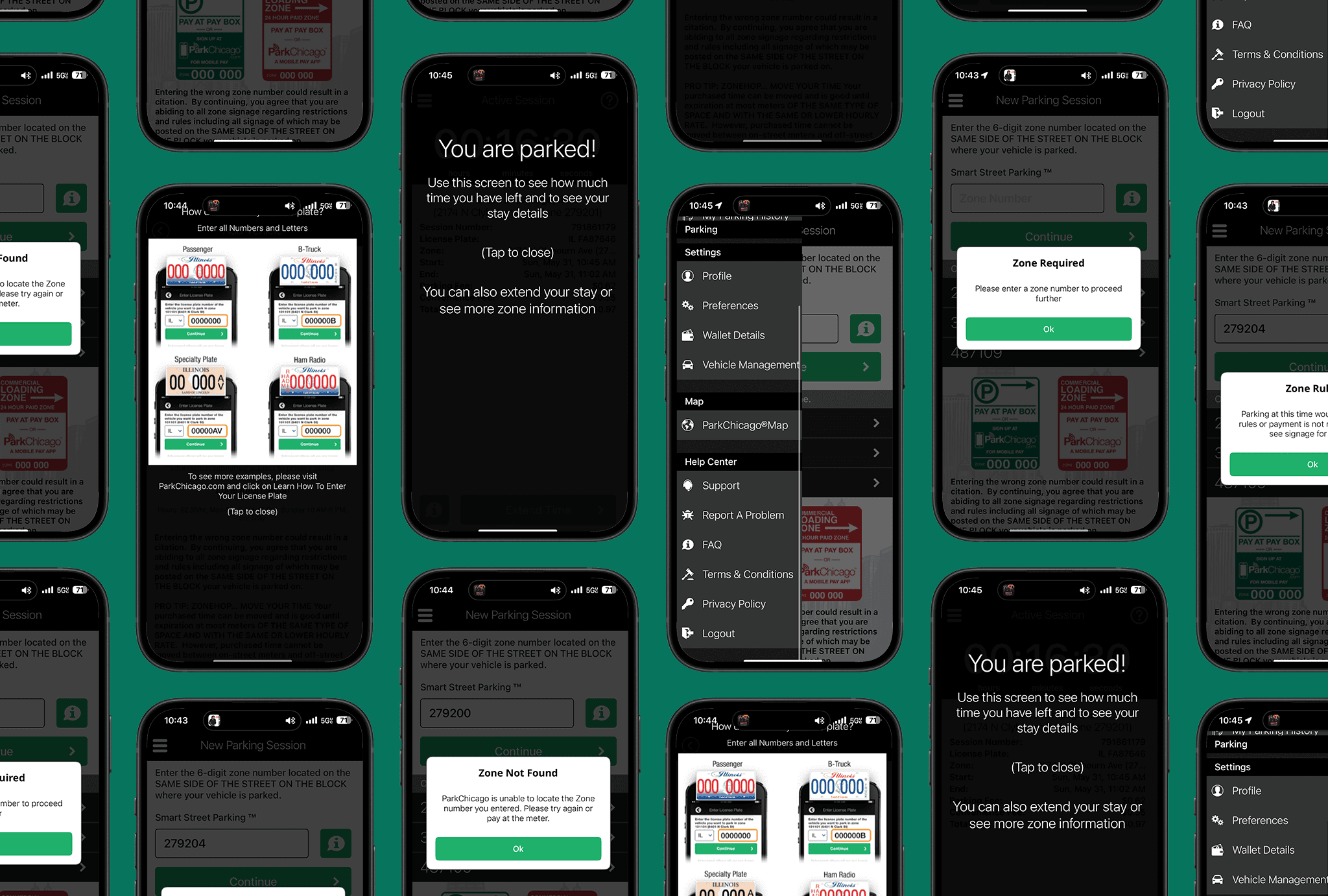
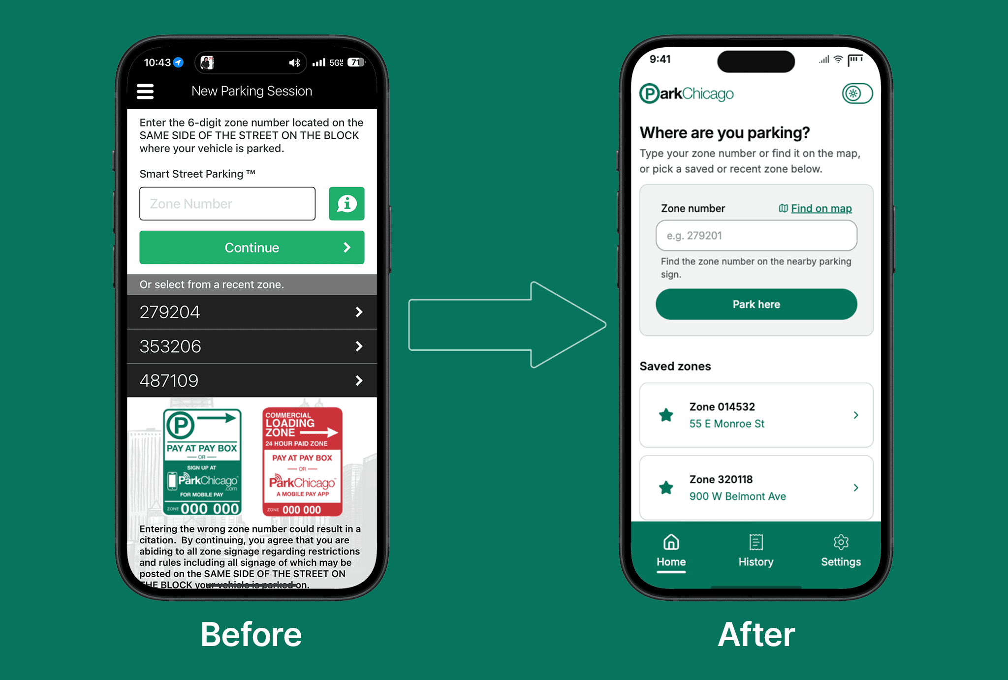
If you open the original app and count how much of it is not the task, it's pretty shocking. Pro-tips. Help overlays. A wall of program and legal copy. A stepper that moves one minute at a time. A hamburger menu hiding the things you came for. Two separate home screens, depending on whether you are already parked. A history page where the app tells you to go check on a browser.
My read: all of that scaffolding is a symptom. When a flow is not clear on its own, teams bolt on tips and warnings to compensate, and every bolt-on puts more distance between the user and their goal. The fix is not better tips. It is a flow clear enough that none are needed.
So one test persists through every screen of the redesign: does the interface still have to explain itself? Wherever the answer was yes, the flow underneath was not finished.
The Objectives & Key Results
Five goals shaped the work:
Make the core job the whole app.
Collapse the pay flow to its essentials.
Replace scaffolding with clarity.
Make feedback accessible by construction, grounded in WCAG 2.2.
Build on a real design system, not one-off screens, with light and dark and accessibility designed in from the first token.

The Process
Build the system before the screens. I started with a token page, color, radius, and spacing in both light and dark, then built a component gallery where each part was perfected in isolation, then assembled screens from those parts. Nothing uses a raw color value. Every component references a named token. That structural consistency is what keeps an AI-assisted build from looking AI-built.
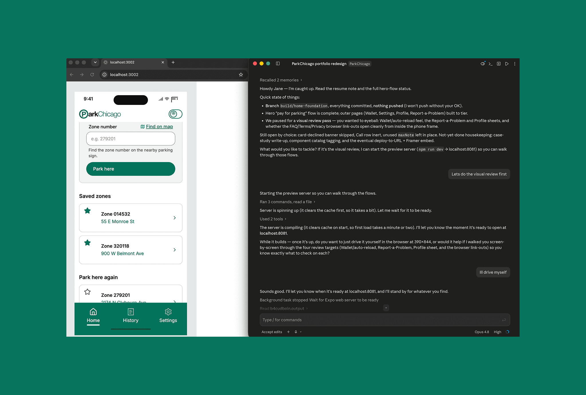
Design in code, with AI as a build partner. I designed in code using Claude Code, but the judgment stayed mine. The leverage came from doing the system thinking up front so the AI assembled from a considered kit instead of improvising pixels. The payoff is a real, running app I can hand someone to try.
Tier the effort honestly. The pay-for-parking flow got full interactivity and deliberate component work. The outer pages, wallet, profile, and settings, were built to look right and link correctly. Depth where it demonstrates judgment, coverage everywhere else.
Start from the audit. I worked from a full audit of the original app to locate exactly where the scaffolding lived and what each screen was really deciding. Then I designed the hardest case (multiple stacked parking sessions) first and treated the single-session view as the one-card version of it.
The Solution
The redesign holds together on two systems and one clear main path.
A place for everything. Every screen answers one question: is this a place you go, or a thing you do? Destinations (Home, History, Settings) carry the navigation and the mode toggle. Full-page overlays carry committed tasks and reading. Sheets carry quick sub-steps over a screen that stays put. One firm rule keeps it from tangling: a sheet never opens over another sheet.
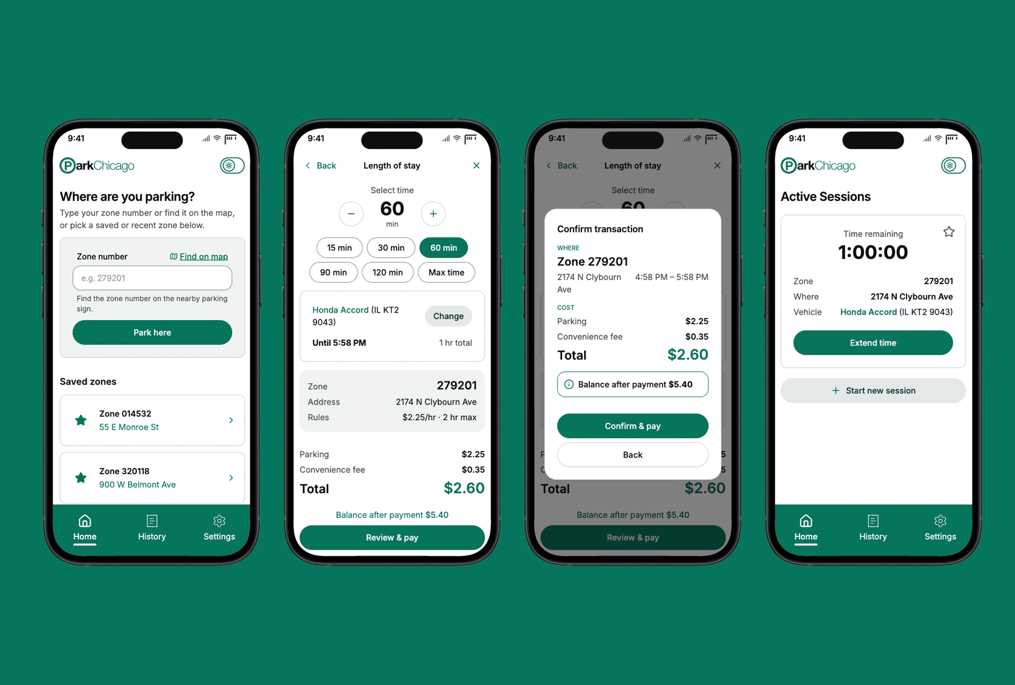
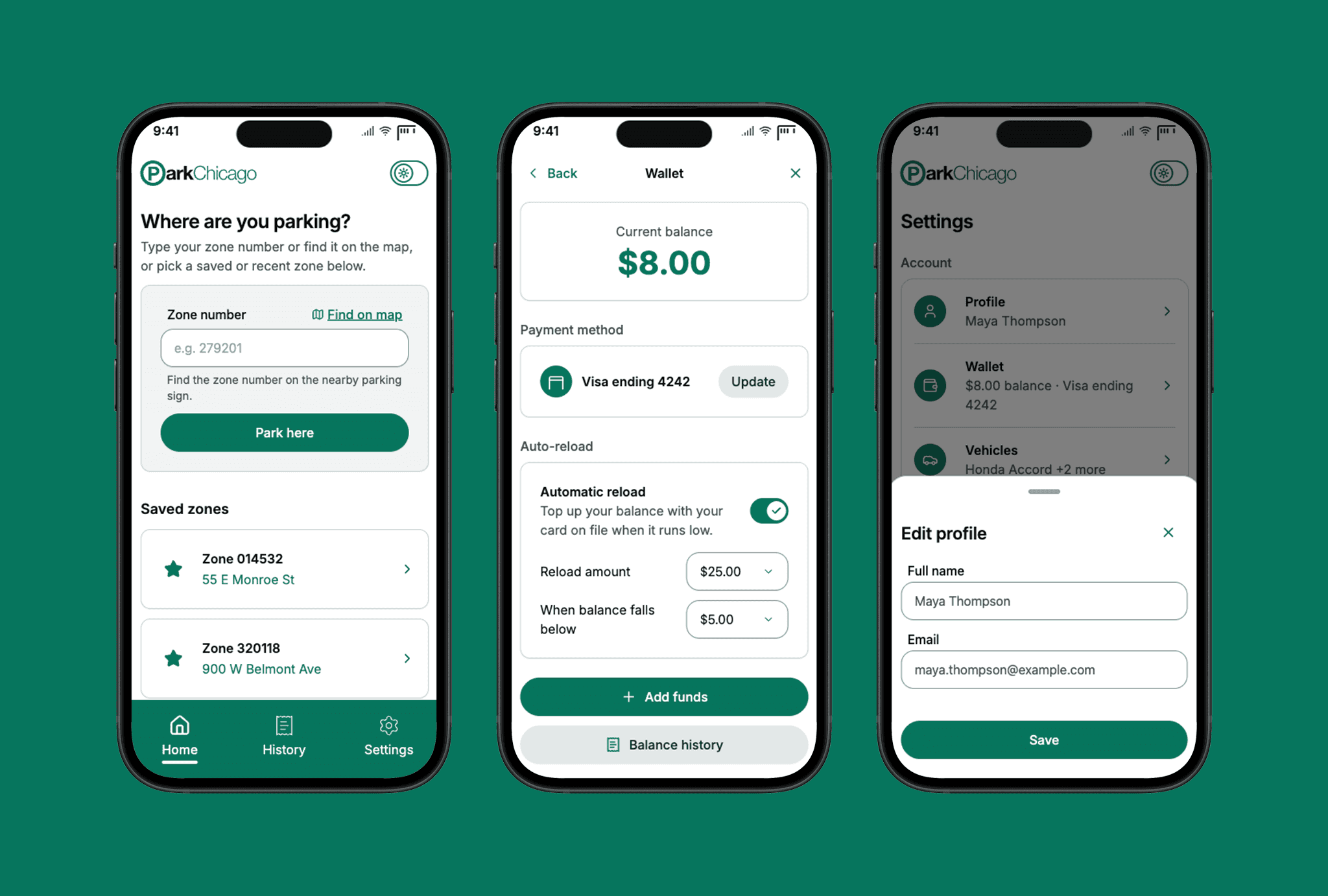
The main "Pay for Parking" path. The zone entry leads, with a persistent label and a Find on map escape hatch. Below it, Saved zones, kept deliberately and ranked first, then Recent zones. A star on any card saves a spot, but with no nicknames, because different sides of a street can be different zones and the real zone number has to stay prominent. From there: a single duration screen with live cost and end-time; a confirmation dialog rebuilt into a clear Where, When, Cost hierarchy; and an active session that puts the countdown first, with Extend as the primary action, confirming payment with a toast because the receipt now lives in History.
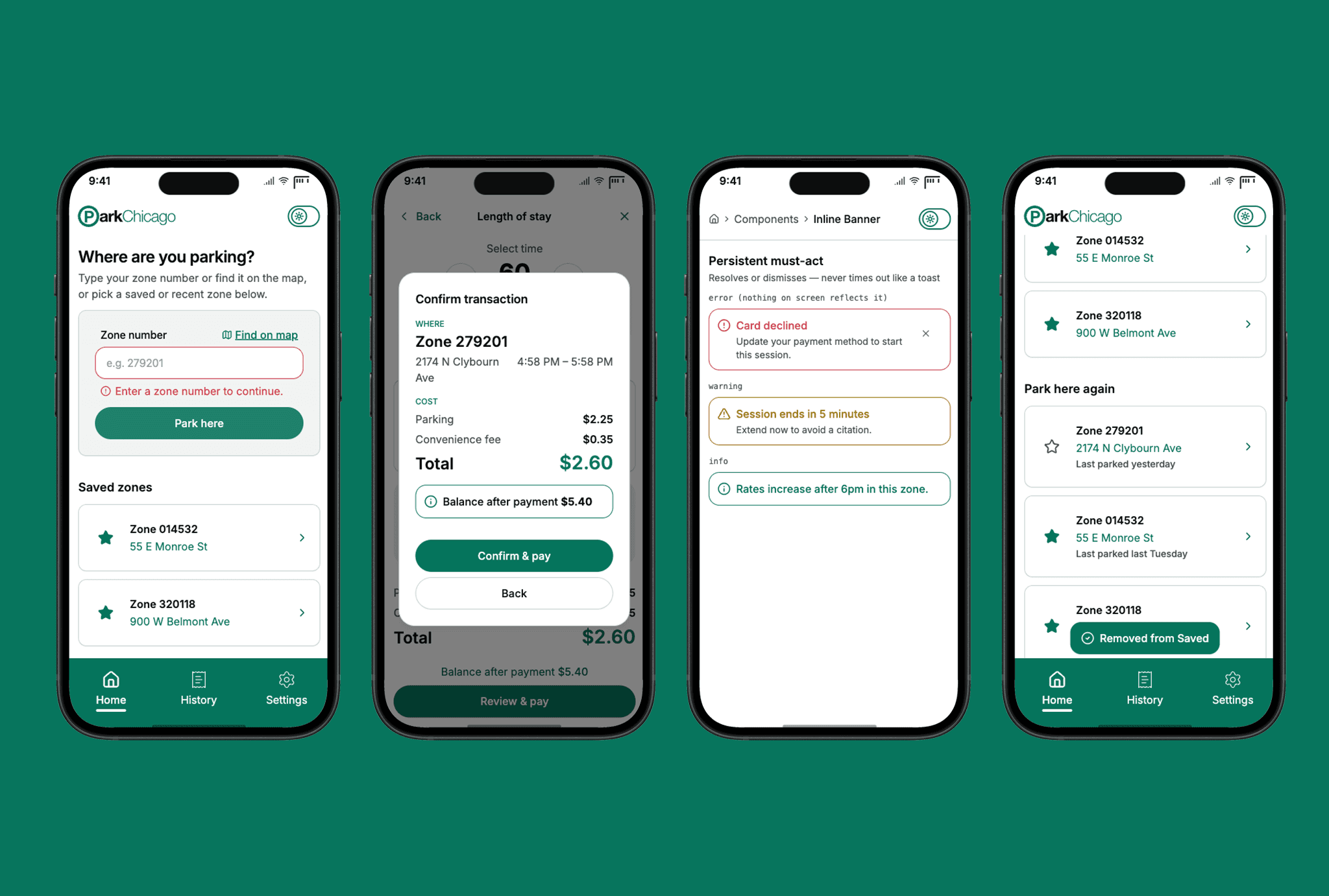
Feedback follows one accessible model. Four mechanisms (inline validation, toast, inline banner, and confirmation dialog) are used to provide feedback, all grounded in WCAG 2.2 (Timing, Status Messages). The rule that anchors it: no message ever lives only inside a timed toast, so nothing critical can vanish before a slower reader catches it.
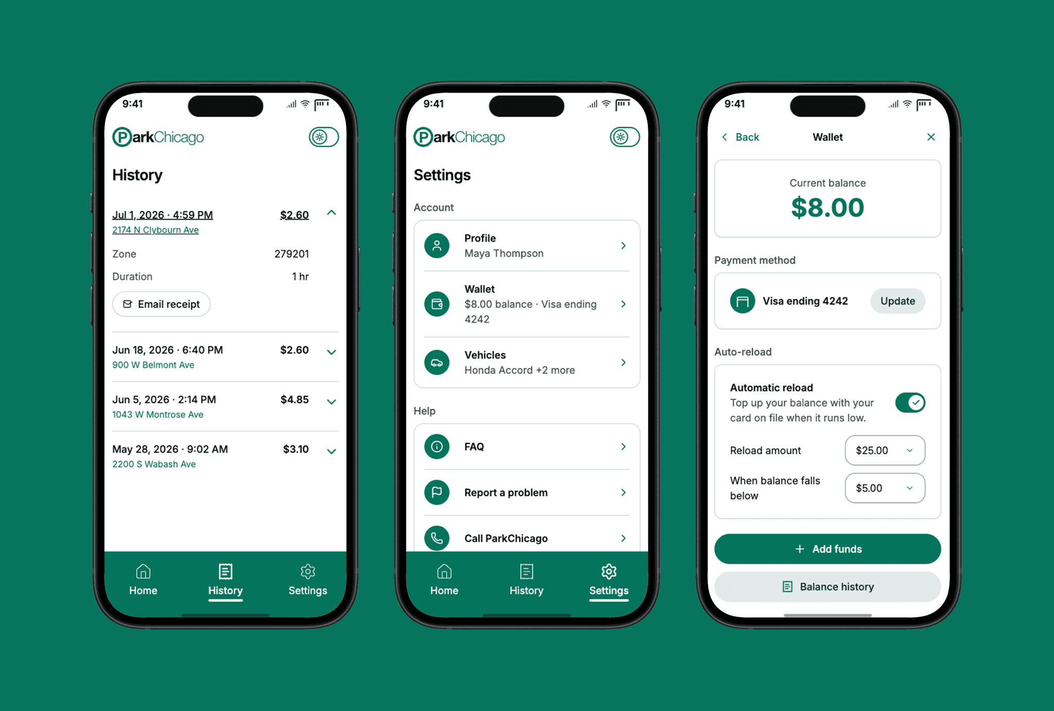
The rest, made real. History is an accordion of receipts you can expand and email, replacing the original's send-you-to-a-desktop dead end. Wallet leads with balance and a live auto-reload control. Settings is a calm, read-only hub, each row opening a sheet to edit.
The Results
The final result of this project is a working product, not a mockup: https://parkchicago-janedouglass.netlify.app/
The redesign is a complete, interactive app you can use in a browser. Start a session, watch the cost update, confirm, extend, and pull up a receipt.
The concrete outcomes, before and after:
Two home screens became one two-state Home.
A hamburger menu became three always-visible destinations.
A multi-screen duration flow became one screen with live cost and end-time.
A one-minute stepper is gone, replaced by presets plus a fine-tune control.
Blocking dialogs became inline validation, with a single confirmation reserved for the charge itself.
A desktop-only history became a full in-app history of expandable, emailable receipts.
A pro-tip and legal wall became one line plus progressive disclosure.
Underneath all of it, one design system: three-tier tokens, a component library, light and dark from day one, and accessibility built in from the first token.